> For the complete documentation index, see [llms.txt](https://docs.nexthink.com/platform/llms.txt). Markdown versions of documentation pages are available by appending `.md` to page URLs; this page is available as [Markdown](https://docs.nexthink.com/platform/user-guide/device-view/timeline.md).
# Timeline
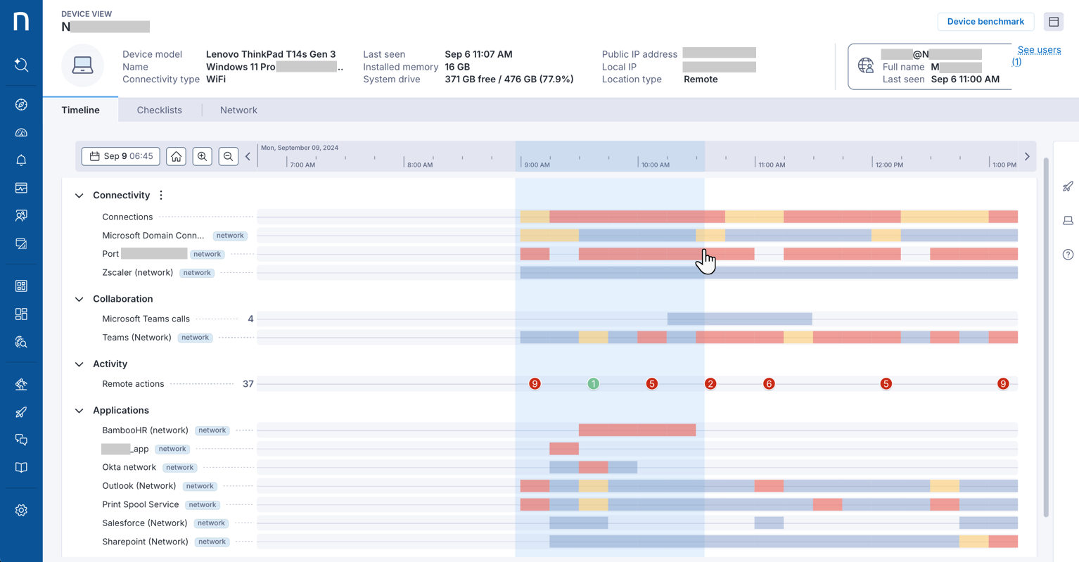
The **Timeline** tab presents data and events that span a period of up to 30 days in various sections.
{% hint style="info" %}
The timeline color conventions facilitate spotting issues. Events in red are a quick indicator of underperforming metrics and problems.
{% endhint %}
The following sections explain which chronological device events are shown in each category.
## Understanding Timeline metrics
### Alerts and errors
Shows three categories of error-type events
* **Alerts**: Shows alerts that impacted this device.
* **Errors**: Shows system and application crashes.
* **Freezes**: Shows user-impacting freeze events — application freezes that occurred while the application was in the foreground on an unlocked device.
{% hint style="info" %}
Freeze events are available on Windows only and require Collector version 26.6 or above.
{% endhint %}
### Device performance
Shows CPU, memory usage, system drive space, GPU, NPU, and disk performance. Events are shown in 5-minute intervals.
{% hint style="info" %}
Device Performance metric thresholds inherit directly from DEX score thresholds, including threshold values customized by administrators through **Digital Experience Score Management.**
* For a list of default threshold values, see [Device view timeline metric thresholds](https://edocs.nexthink.com/nexthink-infinity/infinity-specifications/device-view-timeline-metric-thresholds).
* To customize thresholds, see [Digital Experience Score Management](/platform/user-guide/administration/system-configuration/digital-experience-score-management.md).
{% endhint %}
CPU
By default, the timeline shows the normalized CPU usage:
Select an event on the timeline to drill down to it. The timeline drill down panel opens on the right side, where you can select the metrics and binaries that contribute to the CPU usage.
Here you can:
* Identify tasks waiting for the CPU by selecting **CPU queue length** to open its metric-specific timeline.
* Identify if the CPU is throttled and running below its rated speed by selecting **CPU frequency ratio UI label** to open its metric-specific timeline.
* Identify CPU load caused by drivers by selecting **Deferred procedure calls (DPC)** from the **Hardware and kernel/drivers** section to overlay it on the CPU timeline.
* Identify which application is driving CPU load by selecting a binary to add its chart to the **Normalized CPU usage** timeline.
{% hint style="info" %}
**CPU frequency ratio** and **DPC** require Collector version 26.5 or above and are available on Windows only.
{% endhint %}
Memory
By default, timeline shows overall memory usage:
Select an event on the timeline to drill down to it. The timeline drill down panel opens on the right side, where you can see detailed metrics about the memory usage.
For Windows devices, two separate timelines open up for **Memory swap rate** and **Disk queue length**:
For macOS devices, two separate timelines open up for **Memory pressure** and **Memory swap rate**:
{% hint style="info" %}
Memory pressure for macOS requires Collector version 25.8 or higher.
{% endhint %}
GPU
By default, the timeline shows the GPU usage.
Select an event to drill down. The timeline drill down panel opens on the right side, where you can see the GPU name, the usage percentage at the selected time, and the applications contributing to the GPU load with their individual usage. On devices with multiple GPUs, the panel identifies which GPU is in use.
Here you can:
* Select an application from the panel to overlay its individual GPU usage on the timeline.
{% hint style="info" %}
Viewing contributing applications for GPU requires Collector version 26.3 or above and is available on Windows only.
{% endhint %}
NPU
By default, the timeline shows the NPU usage — the processing load from AI inference workloads running on the device.
Select an event to drill down. The timeline drill down panel opens on the right side, where you can see the NPU usage percentage at the selected time and the applications contributing to the NPU load with their individual usage.
Here you can:
* Select an application from the panel to overlay its individual NPU usage on the timeline.
{% hint style="info" %}
Viewing contributing applications for NPU requires Collector version 26.3 or above and is available on Windows only.
{% endhint %}
### Connectivity
Shows Wi-Fi and ethernet in 5-minute intervals. Furthermore shows connections, network applications, and connectivity applications in 15-minute intervals.
#### Wi-Fi
For each Wi-Fi interval, the right-side panel shows:
* Connection details, including the Wi-Fi BSSID, primary physical adapter MAC address, and MAC randomization status.
* Radio details, including the Wi-Fi band, channel width, physical layer protocol, and transmission rate.
* Network and signal details, including local IP addresses and Wi-Fi signal strength.
This includes Wi-Fi 6E connections on the 6 GHz band and Wi-Fi 7 connections using the 802.11be protocol.
{% hint style="info" %}
Wi-Fi 6E, Wi-Fi 7, and Wi-Fi MAC address reporting require Collector version 26.7 or above.
{% endhint %}
### Collaboration
Shows Microsoft Teams, Zoom calls and any applications configured under the Collaboration category.
### Activity
Shows boots and suspends, remote actions, installation and uninstallation of packages and Windows services, configuration changes, Microsoft Teams and Zoom calls (duration of the call).
#### Boots and suspends
The **Boots & suspends** row shows power transition events for the device, including full boots, fast startup resumes, resumes from hibernate and sleep, suspends, and power-off events.
{% hint style="info" %}
Boots and suspends events are available on Windows only and require Collector version 25.8 or above.
{% endhint %}
### Applications
Shows network, desktop and web application usage and events in 15-minute intervals.
Refer to the [Getting started with Applications](broken://pages/NwdyA6aB0KynCVePkboC) documentation for more information about application type.
### User interaction
Shows user interaction, login, logout, locks, unlocks, virtual session events such as Citrix RTT and session network latency in 5-minute intervals.
### Workflow executions
Shows workflows and remote actions in 15-minute intervals.
***
## Using Device View Timeline
### Zooming in and out of the timeline
To zoom in on a specific section of the timeline from the Device View page, choose one of these options:
* Click on the zoom-in or zoom-out buttons to load up to 48 hours of data into the timeline.
* Drag your cursor along the timeline to select the desired timeframe. Narrow the data down to a six-hour timeframe.
Click on the home buttons to adjust the timeline to the events of the *device's last seen date and time*, i.e., the date and time of the last device activity received by the Nexthink instance.
***
### Drilling down to specific events in the timeline
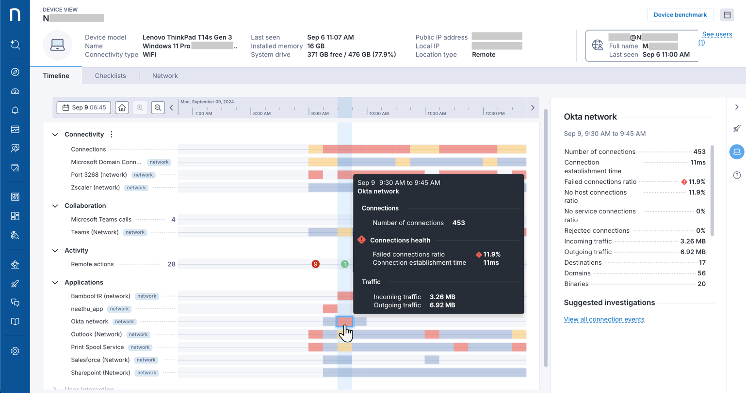
1. Hover over a specific event to display its information details. Both the pop-over and the right-side panel visually indicate, with colored icons, the underperforming metrics contributing to the device issue.
2. Select a specific event to display the selected information details in the right-side panel within the device icon. The information includes device performance, connectivity, activities, application usage, and links to relevant dashboards and **Suggested investigations**.
{% hint style="info" %}
Additionally, the **Actions** icon in the right-side panel allows you to take associated actions from the Device View page on the target device, depending on the user [role](/platform/user-guide/device-view.md#deviceview-requiredpermissionsfordeviceview) permissions.
{% endhint %}
{% hint style="info" %}
Refer to the [Using Device View for call quality issues](/platform/user-guide/collaboration-experience/getting-started-with-collaboration-experience/using-device-view-for-call-quality-issues.md) documentation to leverage the Timeline tab for troubleshooting collaboration tools.
{% endhint %}
### Obtaining binary descriptions from the Timeline side panel
From the [Timeline](/platform/user-guide/device-view/timeline.md) side panel, hover over any binary name to obtain an AI-generated description.
These binary descriptions attempt to attribute a category and subcategory to the binary, providing additional context related to functionality.
{% hint style="info" %}
The system displays the ✦ sparkles icon to indicate AI-generated content or insights. AI is evolving rapidly and delivering great insights, but it can still make mistakes. Nexthink recommends validating your results to ensure accuracy and support informed decision-making.
Refer to the [Nexthink Insights - AI Model Card](https://docs.nexthink.com/legal/global-ai-hub/nexthink-insights-ai-model-card) documentation for more information.
{% endhint %}
***
RELATED TOPICS:
* [Checklists](/platform/user-guide/administration/content-management/checklists-management.md)
* [Ratings](/platform/user-guide/administration/content-management/ratings-management.md)
* [Investigations](/platform/user-guide/investigations.md)
* [Using Device View for call quality issues](/platform/user-guide/collaboration-experience/getting-started-with-collaboration-experience/using-device-view-for-call-quality-issues.md)
---
# Agent Instructions
This documentation is published with GitBook. GitBook is the documentation platform designed so that both humans and AI agents can read, navigate, and reason over technical content effectively. Learn more at gitbook.com.
## Querying This Documentation
If you need additional information that is not directly available in this page, you can query the documentation by asking a question.
Perform an HTTP GET request on the following URL with the `ask` and `goal` query parameters:
```
GET https://docs.nexthink.com/platform/user-guide/device-view/timeline.md?ask=&goal=
```
`ask` is the immediate question: it should be specific, self-contained, and written in natural language.
`goal` is what the user is ultimately trying to achieve, the reason they need the answer. Sharing it helps GitBook give you a better, more relevant answer. A goal is most helpful when it describes the outcome the user wants rather than restating the question. For example, with `ask=how do I create an API token`, a goal like `automate deployments from our CI pipeline` lets GitBook tailor the answer to that use case.
The response will contain a direct answer to the question and relevant excerpts and sources from the documentation.
Use this mechanism when the answer is not explicitly present in the current page, you need clarification or additional context, or you want to retrieve related documentation sections.