> For the complete documentation index, see [llms.txt](https://docs.nexthink.com/platform/llms.txt). Markdown versions of documentation pages are available by appending `.md` to page URLs; this page is available as [Markdown](https://docs.nexthink.com/platform/user-guide/adopt/guide-content-development-from-in-app-adopt-editor/developing-walkthrough-guides/defining-walkthrough-step.md).
# Defining walkthrough Step
## Defining walkthrough Step
After creating a Walkthrough-type guide in Nexthink Applications and accessing the guide in Adopt Editor:
{% stepper %}
{% step %}
### Create a **new Step**
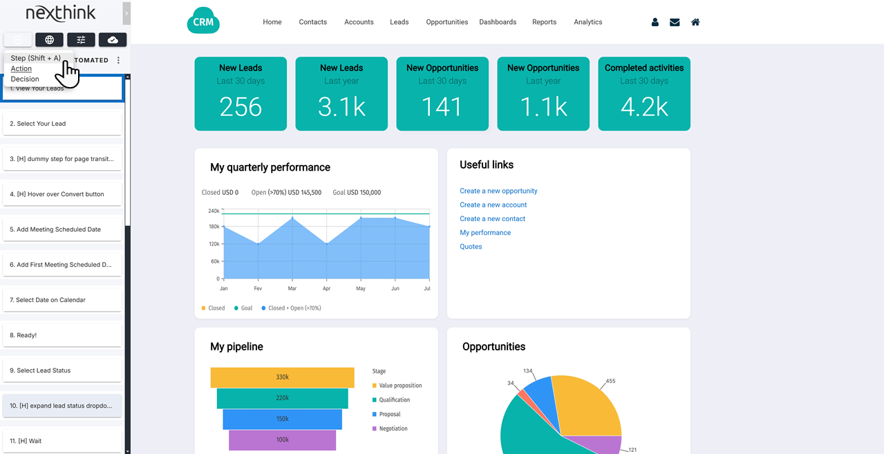
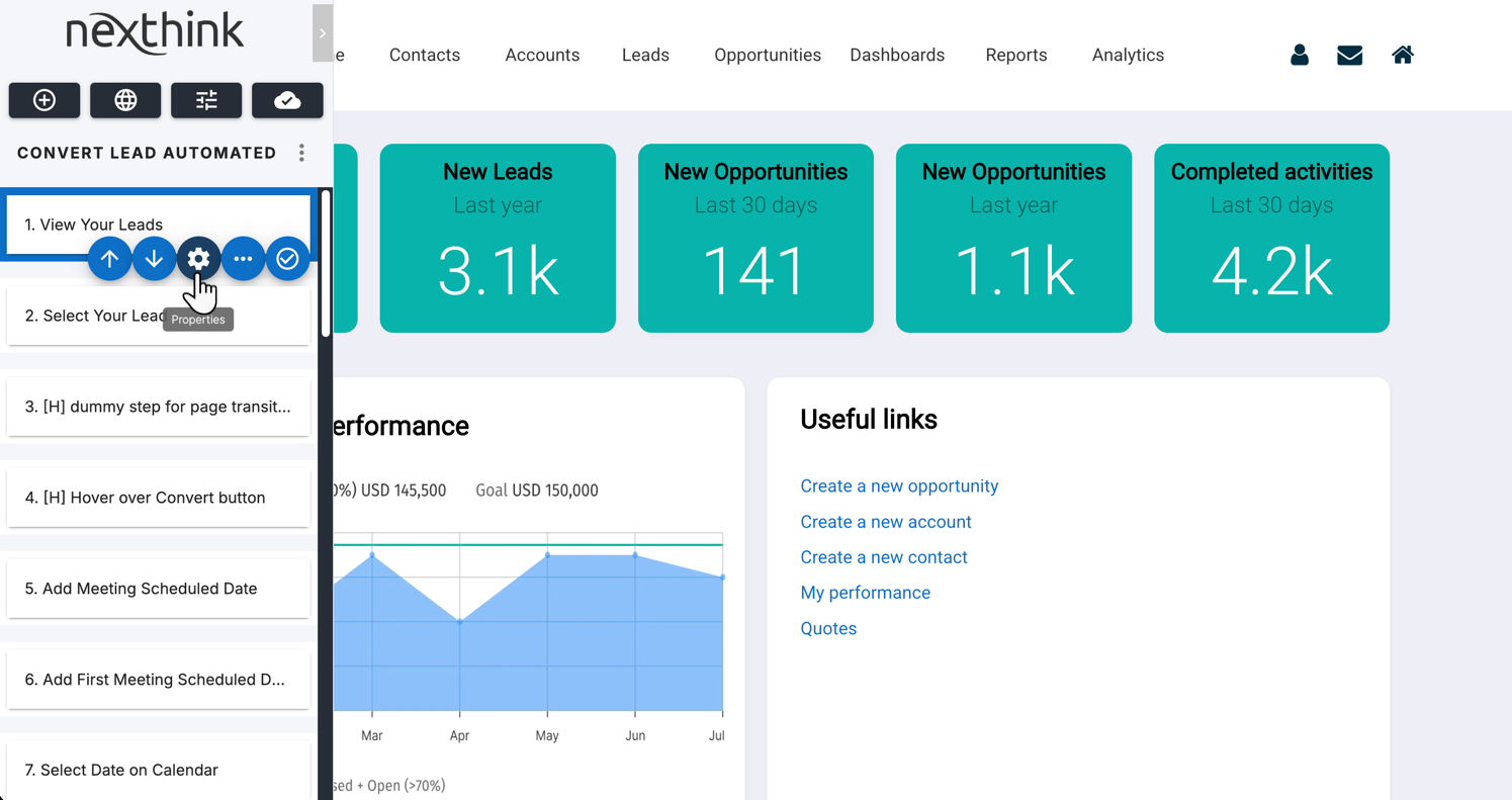
Select **Step** from the drop-down menu, or use the keyboard shortcut **Shift + A.** This activates the element picker, where you can choose an element on the page to associate with this step. Refer to Using Element Selector in Adopt Editor for more information.
Hover the cursor over your page and choose an element by clicking on it or using the **Shift + S** keyboard shortcut. This creates a step assigned to the chosen element.
{% hint style="info" %}
The **Shift + S** shortcut is useful when you cannot select an element with the cursor. For instance, when you select an element in a pop-up menu that is not visible when clicked.
{% endhint %}
{% endstep %}
{% step %}
### Set up the Step **Properties**
Open the step **Properties** to access the property tabs: **Content**, **Appearance**, **Positioning** and **Display.** Use these tabs to:
* Add text and **Content** to walkthrough step
* Define walkthrough step **Appearance**
* Define walkthrough step **Positioning** options
* Define walkthrough step **Trigger** options
Find further details about each tab in the following sections included on this page.
{% endstep %}
{% endstepper %}
***
### Adding text and content to a walkthrough step
From the Adopt Editor left-side panel, access the **Properties** of a step and open the **Content** tab to add content visible and/or audible to employees using the guide.
#### Step content
* Write and format the text using the **Tooltip content** editor.
* Optionally, add images, from an URL or the Asset library.
* Optionally, add links to relevant pages, images, audio or video.
#### Step sound
Add sounds to your guide step.
***
### Defining walkthrough step appearance
From the Adopt Editor left-side panel, access the **Properties** of a guide step and open the **Appearance** tab:
Buttons and actions
You can enable or disable predefined and extra buttons, determining which ones appear on the step.
* Enable the **Next** and **Previous** button to allow for navigation directly on the step.
* Enable extra buttons, which can be used to set up **Action Buttons**.
* Enable the **close cross button**, allowing users to exit a step without completing it.
Step appearance
* Enable the **Step label**, then specify the text that will appear before the step number in the **Step counter** at the bottom of the step. The **Step counter** must be enabled (see [Controls and Indicators](#controls-and-indicators)).
* Enable **Close label**, then specify the text for the close button. The Close action button must be enabled first (see [Controls and Indicators](#controls-and-indicators)).
Step interaction
* You can **prevent users from interacting** with page elements while the step is visible. This option applies to page elements surrounding the step or the entire page.
* You can also **prevent users from scrolling** through the page while the step is visible.
Shadow
This option allows the darkening or blurring of the page, except for the required element for step completion.
* Select the **Type** of the shadow:
* Off (shadow turned off)
* Transparent
* Blurred background.
* If you enable the **Shadow** option, you can apply a gradual transition **Animation** instead of an instant visual effect.
Border
* Add a **solid** or **gradient** border to the UI element linked to the step. Select **Off** to remove the border.
* If you enable the **Border** option, you can apply a gradual transition **Animation** instead of an instant visual effect.
Controls and indicators
Display the action button that allows advancing through a step.
* Display the **Close action button** to allow users to close the step.
* Display a **Step counter** indicating how many steps users have completed.
* Display a counter showing the **total number of steps** in the Walkthrough.
* Enable step encapsulation, which places the step inside its own iframe. This prevents interfering with the overall page structure during rendering.
* Display **Arrow**, a tooltip pointer that visually connects the tooltip to its associated interface element.
Step Overlay
Define the overall appearance of your Step and how it renders on the page.
* **Tooltip** is the standard Step appearance, a box that displays relative to the assigned element.
* **Smart Page** is a larger box in the center of the screen, recommended for video content and large images.
* **Notice** is a broad box at the bottom of the page, similar to a notification.
* **Hidden** removes the Step from the user view. This option is recommended for transitions between Steps where users are navigated to the correct page. Refer to Defining Walkthrough positioning options for more information.
* **Sidebar** occupies the left side of the page, top to bottom. This option is recommended for `.pdf` files or large amounts of content.
Animation
* **Step**: Add a **Fade**, **Zoom** or no animation to the step as it appears or disappears.
* **Element**: When users reach or complete the step, add a **Fade**, **Zoom**, or no animation to the assigned element.
* If you enable a zoom animation on either of the options above, define the **Zoom strength**.
***
### Defining walkthrough step positioning options
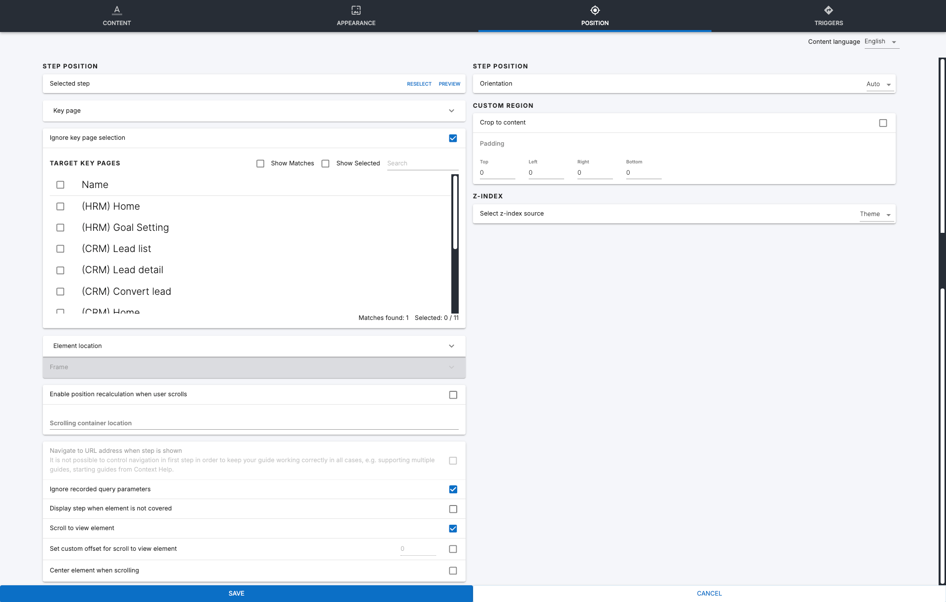
From the Adopt Editor left-side panel, access the **Properties** of a Step and open the **Position** tab:
#### **Step position**
Selected step — element selectors & instability Auto-fix
**Preview** the element associated with the Step on the web application page. If needed, **Reselect** the element or **Auto-fix** unstable selectors.
Adopt Editor enables the **Auto-fix selectors** button when 30% or more of the Step's selectors are unstable—that is, selectors relying on dynamically generated identifiers—but at least one selector still correctly identifies the target element. The system uses the working selector to regenerate the unstable selectors and reduce selector instability.
The **Auto-fix** feature does not require you to **Reselect** the element or re-record the Step, except when the element is removed or when multiple working selectors identify different elements, preventing you from implementing selector **Auto-fix**. In these cases, **Reselect** the element manually.
{% hint style="warning" %}
**Auto-fix** operates on a single Step and does not repair selectors across an entire guide.
{% endhint %}
**Be notified of guides with unstable selectors**
To proactively identify unstable Steps in deployed guides, install and use the **Adopt Unstable Selectors** predefined monitor from the Nexthink Library. The monitor generates alerts when Steps contain unstable selectors.
Refer to [Nexthink Library](/platform/user-guide/nexthink-library.md#nexthinklibrary-accessingnexthinklibrary) for library content setup.
When the monitor alerts you about a guide with unstable selectors:
* Unpublish the guide in Nexthink.
* Open the guide in Adopt Editor and identify the step flagged by the system—see the screenshot below.
* Check the affected Step's **Position** tab for the **Auto-fix selectors** option.
Key pages
* **Navigation** lets you direct users to a specific page when they reach the Step. The **Location URL pattern** makes pages with dynamic addresses more stable for Guide purposes.
* **Target Key pages** by ticking **Show matches** and/or selecting a key page from the list**.** You may also use the **Search** bar to filter the results by name.
* Predefined key pages allow you to associate the step with a dynamic URL still recognizable by Nexthink Infinity, for example: `https://impl.workday.com/*/d/home.htmld`
* If you have no matching key pages, refer to the Key pages documentation for more information.
* **Ignore key page selection** and define a static URL under **Navigation** if needed.
Element location
Optionally, enable or disable **Element selectors**—configured by default in Nexthink Infinity Adoption settings—to make them specific to this step.
* The **Element XPath** selector override can be localized to a different language, given that it targets a specific block of text.
{% hint style="warning" %}
When using Adopt Editor within an application with iframes, the **Show matches** option cannot display the matching key page for the iframe in which the target element resides.
In these cases, **Reselect** the target element to display the matching key page.
{% endhint %}
Enable position recalculation when the user scrolls
**Enable position recalculation when the user scrolls** in cases where you have multiple containers with scroll bars aside from the main page. Generally, Adopt attempts to scroll through the main page to reach a step's associated element. Enable this option and specify a container by its `element ID` to restrict the scrolling to that container.
Guide defaults
Enable or disable **Guide defaults** present in the Nexthink Adoption settings to make them specific to this step:
* **Navigate to URL address when step is shown:** Enable this setting to automatically navigate to the configured URL address when this step is visible to the user.
* This setting cannot be enabled on the first step of a Walkthrough.
* **Ignore recorded query parameters:** When a step navigates to a specific URL that contains a query, for example `http://google.com/?query`, enable this setting to disregard the query, meaning everything after`/?`, and only use the base URL.
* **Display step when element is not covered:** Generally, Adopt displays steps even when the associated elements are being overlapped by a modal window or dialogue. Enable this setting to ensure the step only displays when the element is not being overlapped by other elements.
* **Scroll to view element:** Enable this setting to automatically scroll the page until the associated element is visible.
* **Center element when scrolling:** Generally, Adopt attempts to scroll to an element in a way that respects page spacing. Enable this setting to attempt to center it relative to the page.
* **Set custom offset for scroll to view element:** The nature of certain web pages can cause scrolling calculation errors. Enable this setting and add a value in pixels to add that much additional distance to the scrolling. This offset is added to the direction Adopt is scrolling towards during a given step.
* Select an **Orientation** to determine the direction from which the step renders, based on the associated element's position.
* **Auto** is the default setting. Steps render from the top unless the element is at the top of the page, in which case they render from the bottom.
* Select **top**, **right**, **bottom** or **left** to specify a rendering direction.
{% hint style="info" %}
Use the **Orientation**, **Custom region** and **z-index** options to define the Step position relative to the selected element.
{% endhint %}
{% hint style="info" %}
If the system cannot display your preferred position due to space constraints, Adopt places it in the most suitable position in a clockwise direction.
{% endhint %}
#### **Custom region**
Defining a **Custom region** allows you to expand or reduce the highlighted area of an element when the relevant step is visible.
* **Crop to content** allows Adopt to attempt to define an area that contains only the relevant content of the element, such as a text label, rather than the entire element.
* This setting may not function due to improper page formatting.
* Define directional **Padding**, in pixels, to shape the custom region to suit your needs.
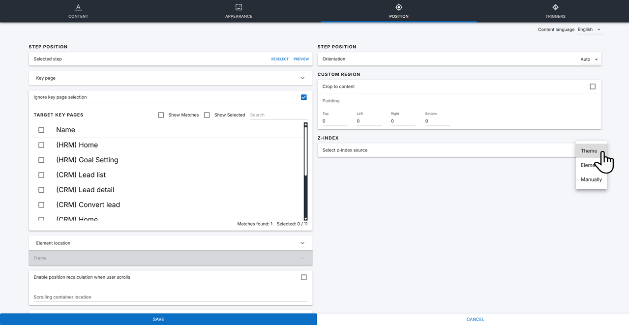
#### **Z-index**
Select a **Z-index source** to determine the z-index origin point from which the Nexthink extension renders the step.
* **Theme** uses the Nexthink default z-index value of `73999`.
* **Element** uses the associated element's z-index value, determined via page formatting.
* **Manual** allows you to define z-index values for the **shadow** and **step**. Ensure the step has at least an increment of `1` over the shadow for correct display.
***
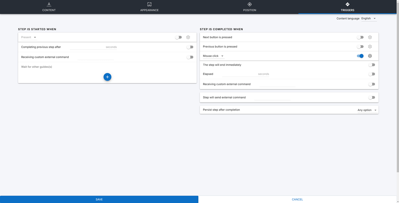
### Defining walkthrough step trigger options
From the Adopt Editor left-side panel, access the **Properties** of a Step and open the **Triggers** tab:
#### Define **when a Step is started**
* **Spot/Unspot** triggers work for elements visible on the page, while **Present/Unpresent** refer to elements that exist but may not be visible on the page—set as `hidden` in the CSS, for example.
* **Spot in viewport** triggers the Step when the element is visible on the employee screen.
* **Fill select/value and move on** triggers the Step for interactions with input fields on the page, such as typing a word in a search bar or selecting an option from a dropdown.
* **Element loses focus** triggers the Step when clicking away from a focused page elements. For example, click away to disable typing from a search bar.
* Set a timer for the Step to appear after previous Step completion, measured in seconds.
* Define custom external commands to receive as a trigger for Step appearance.
* Define a list of other Guides, causing the Step to apear only when those Guides are completed.
{% hint style="info" %}
You must create custom external commands in the **Triggers** tab of the previous Step configuration.
{% endhint %}
#### Define **when a Step is completed**
* When the user presses the **Next** button**.**
* Optionally, add a **Next** or **Done** label.
* When the user presses the **Previous** button**.**
* Optionally, add a **Previous** label.
* **Spot/Unspot** triggers work for elements visible on the page, while **Present/Unpresent** refer to elements that exist but may not be visible on the page—set as `hidden` in the CSS, for example.
* **Spot in viewport** triggers the Step when the element is visible on the employee screen.
* **Fill select/value and move on** triggers the Step for interactions with input fields on the page, such as typing a word in a search bar or selecting an option from a dropdown.
* **Element loses focus** triggers the Step when clicking away from a focused page elements. For example, click away to disable typing from a search bar.
* Set a timer for Adopt to end the Step, measured in seconds.
* Define custom external commands to receive as a trigger for Step completion.
* Define whether the Step sends a custom external command on completion, and create the command.
* Define whether a Step persists after completion:
* **On URL address change** causes the Step to persist after the Guide navigates to another page.
* **On page reload** causes the Step to persist after users refresh the page.
* **Going back in history** causes the Step to persist after users return to a previous page.
* **Any option** causes the Step to persist when any of the above criteria is met.
---
# Agent Instructions
This documentation is published with GitBook. GitBook is the documentation platform designed so that both humans and AI agents can read, navigate, and reason over technical content effectively. Learn more at gitbook.com.
## Querying This Documentation
If you need additional information that is not directly available in this page, you can query the documentation dynamically by asking a question.
Perform an HTTP GET request on the current page URL with the `ask` query parameter, and the optional `goal` query parameter:
```
GET https://docs.nexthink.com/platform/user-guide/adopt/guide-content-development-from-in-app-adopt-editor/developing-walkthrough-guides/defining-walkthrough-step.md?ask=&goal=
```
`ask` is the immediate question: it should be specific, self-contained, and written in natural language.
`goal` is optional and describes the broader end goal you are ultimately trying to accomplish on behalf of the user. GitBook uses it to tailor the answer towards what is most useful for that goal.
The response will contain a direct answer to the question and relevant excerpts and sources from the documentation.
Use this mechanism when the answer is not explicitly present in the current page, you need clarification or additional context, or you want to retrieve related documentation sections.